arctis/ui
2026open source React component library and documentation site. Thoughtful components and blocks you install, own, and reshape around your design system.
- role
- design & engineering
- stack
- next.js
- react
- typescript
overview
arctis/ui is an open source React component library I designed and built as a clean foundation for modern design systems. It combines reusable components, composed page blocks, live documentation, and a simple installation workflow with source code that becomes part of your project.
This is a working public product, not a concept. The documentation is live at ui.arctis.sh, the source is available on GitHub, and the package is published to npm as @arctis-sh/ui. Components can be added individually with npx @arctis-sh/ui@latest add, then edited like any other code in the application.
what it is
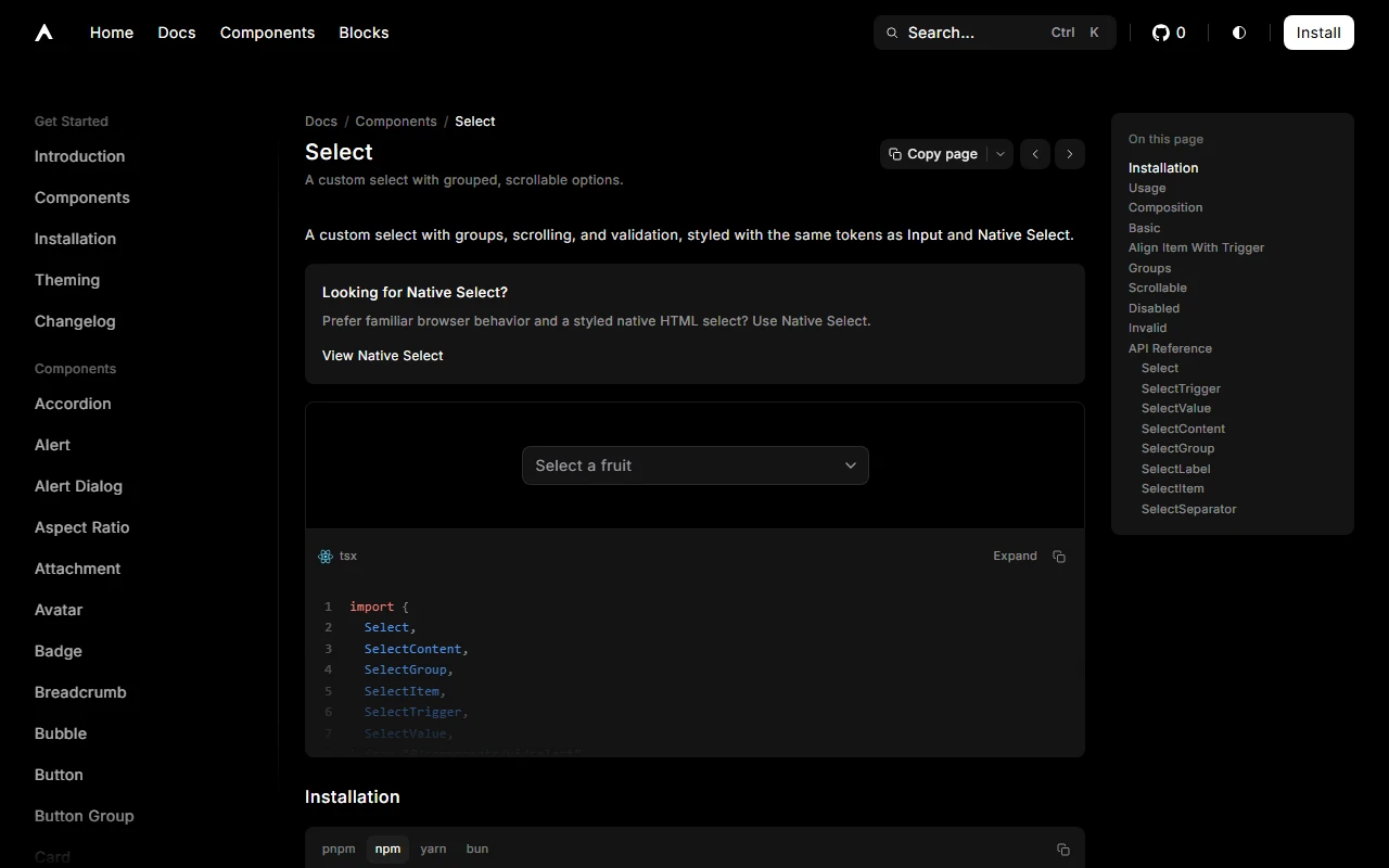
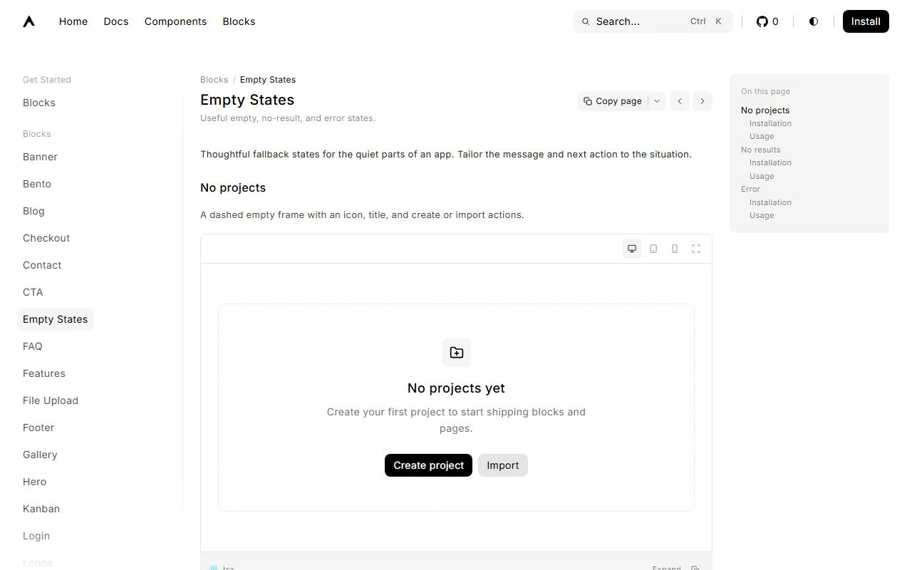
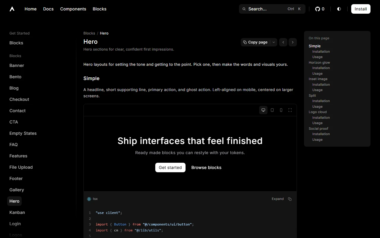
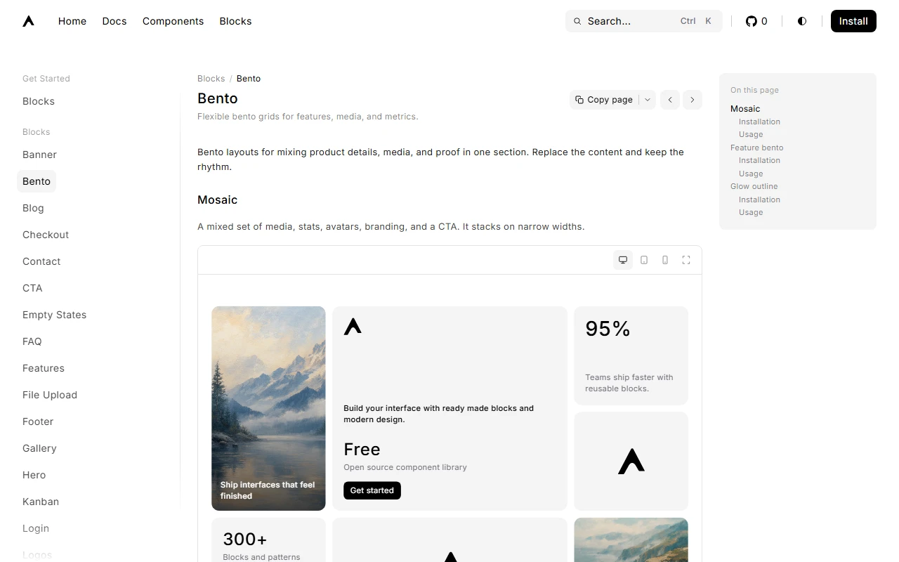
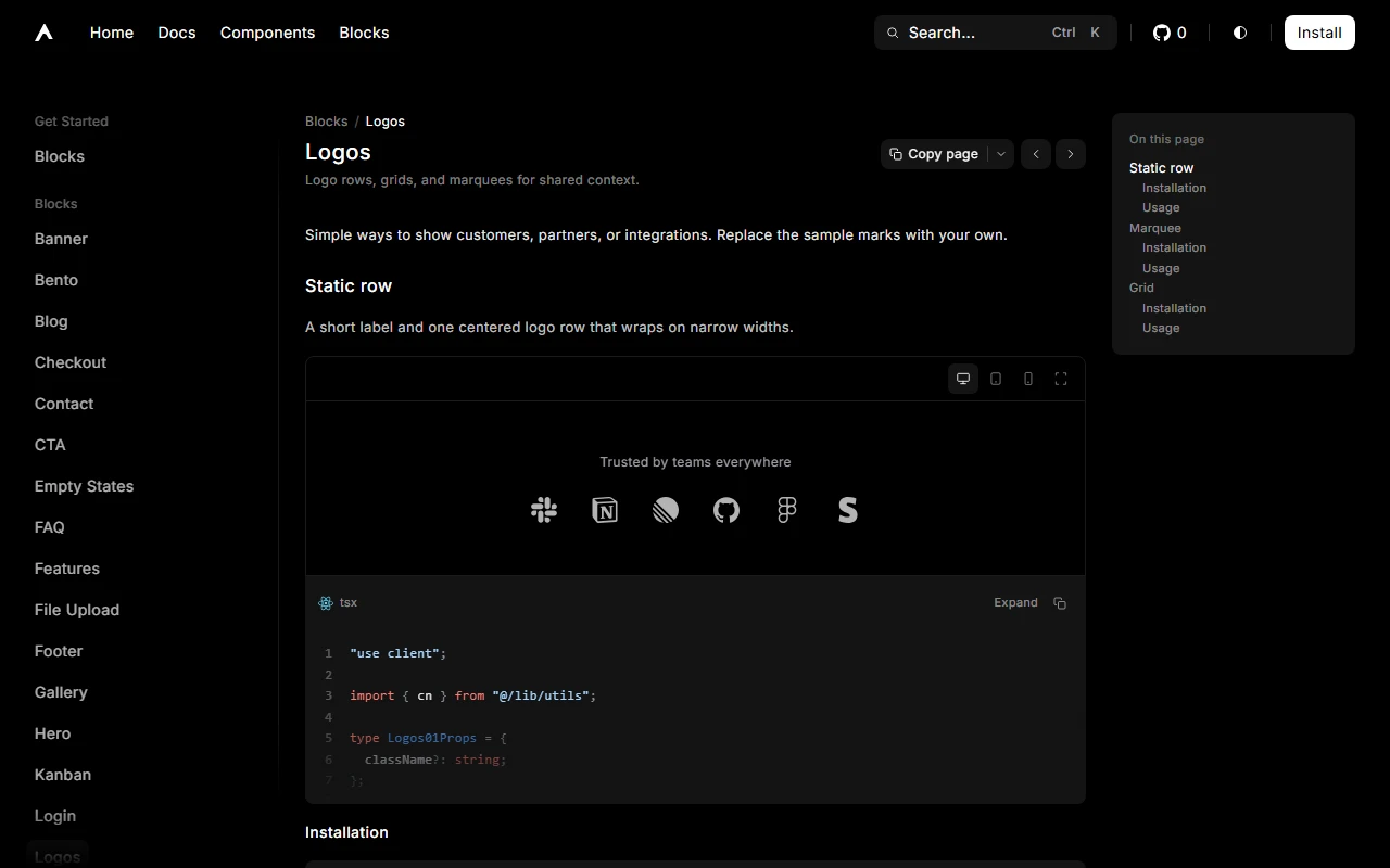
The library has two main surfaces. Components provide the primitives used throughout modern applications, including buttons, selects, dialogs, navigation menus, tables, toasts, forms, and overlays. Blocks combine those primitives into complete sections for marketing and product interfaces, including heroes, bento layouts, pricing, authentication, empty states, and more.
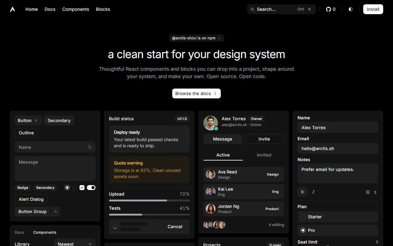
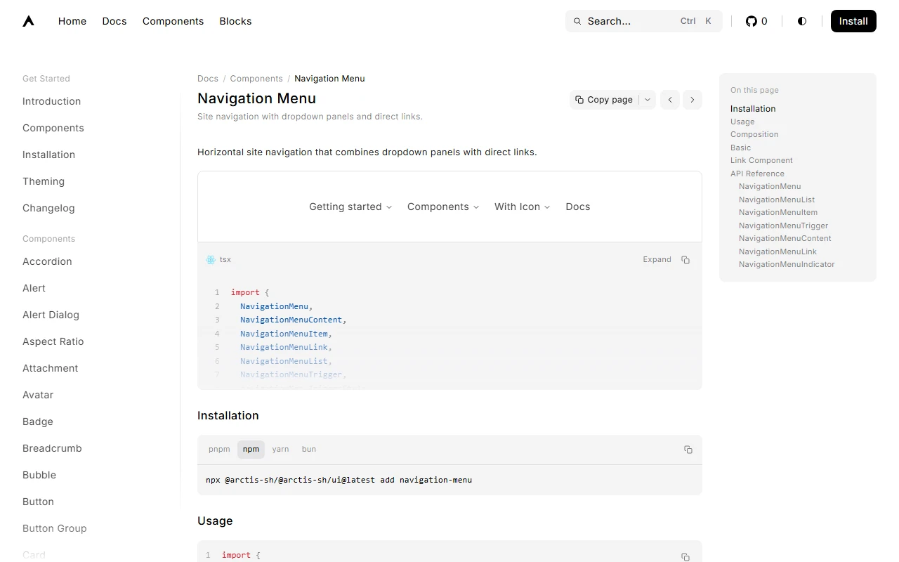
The site is part of the product. The home page presents the system through a dense grid of real interface scenes. Documentation covers installation, theming, composition, variants, and component APIs through live previews and practical examples.
Installation stays intentionally close to the source. Add only what you need, keep the generated files inside your project, and shape them around your own tokens and requirements. Styling is driven by CSS variables so light and dark themes share one coherent system.
how i built it
I treated the component library, registry, command line workflow, and documentation site as one product.
Next.js powers the documentation experience. React and TypeScript define the component APIs. Tailwind CSS handles styling and token driven customization. Base UI supports complex interactive behavior such as overlays, selects, menus, and positioning.
Each component follows the same product grammar: clear composition, practical usage, meaningful variants, live examples, and an API that remains readable. Blocks reuse those primitives rather than introducing isolated visual patterns.
The main challenge was restraint. A library of this size can quickly become inconsistent or noisy. Every component needed a clear purpose, a predictable interface, and a reason to exist within the wider system.
design notes
Most component libraries either impose a finished brand or provide foundations that still require substantial design work. arctis/ui aims for a more useful middle ground: calm defaults, thoughtful composition, readable documentation, and enough flexibility for teams to make the system their own.
Typography stays quiet. Navigation and documentation chrome stay light. Previews place components inside believable product scenes rather than empty playgrounds.
The home grid expresses the central idea in one view. Buttons, alerts, sheets, messages, tables, forms, and media all share the same visual rhythm. If the system only works when each component is shown alone, it is not finished.
outcome
The result is a live open source UI library with a complete documentation site, public source repository, npm package, registry, and clear installation workflow.
Building arctis/ui gave me a complete design systems project spanning component architecture, interaction design, theming, documentation, distribution, and the details that make reusable code feel considered from the first install.
disclaimer
The information on this page is provided for general portfolio and informational purposes only. No representation or warranty is made as to its accuracy, completeness, currency, or correctness, and no reliance should be placed on it as advice or as a statement of fact. All content is offered without guarantee and may be updated or corrected at any time without notice.